Photoshop

Tutorial review: The Complete Guide To Portraiture by Sandro Miller

When I first heard about ‘The Complete Guide To Portraiture & Building A Body Of Work For Print & Publication’ I knew this was one I just had to watch. After all, it’s about all the things I love in photography: travel, portraiture, lighting and retouching. So I contacted the guys over at RGG EDU (that's short for Rob and Gary's Great EDUcation), the producers of this video, and they were kind enough to set me up with a review copy and a really cool discount code for readers of this blog. Full details are at the end of this post but basically, it means that as a reader of my blog, you can get RGG EDU's newly released 6 hour Capture One Pro training video as a free bonus when you purchase the Sandro Miller tutorial.

UPDATE: the discount code no longer works, but there is currently (until May 29th, 2017) a 66 percent discount on this tutorial, making this an even much better deal than the one I had for you back when I originally wrote this review...

This tutorial follows internationally acclaimed photographer Sandro Miller from start to finish on a project in which he photographs indigenous tribes in the remote and sometimes downright dangerous parts of Papua New Guinea. Here's the official trailer below.

This day and age, everyone and his dog seem to be producing video tutorials geared towards photographers. As I can tell from my own area of expertise, Lightroom training, there’s a lot of chaff amongst the wheat. Yet, the videos from RGG EDU, a relatively young photography tutorial website, definitely fall in the ‘wheat’ category. Having bought, watched and highly appreciated their ‘The Complete Guide To Composite Photography, Color & Composition with Erik Almås’, I knew I could expect high quality, and I wasn’t disappointed. By the way, here's an in-depth (Dutch-only, unfortunately) review of the Erik Almås tutorial.

Sandro Miller

One of Sandro's most recent books is the result of a seventeen-year collaboration between photographer and subject. I'll try and keep that in mind the next time I make a one-minute portrait of someone :-)

One of Sandro's most recent books is the result of a seventeen-year collaboration between photographer and subject. I'll try and keep that in mind the next time I make a one-minute portrait of someone :-)

To be really honest, I did not know Sandro Miller. At least not by name. But I did know some of his work, and chances are you do, too: just google his latest book Malkovich Malkovich Malkovich, which features photographs that Sandro made during his 17 year friendship with this incredibly versatile actor.

Incidentally, this is just one of the things this tutorial taught me: getting a book published takes time and patience. Sandro visited Cuba 14 times before he did a book on it. But... it is not undoable, especially after watching this tutorial...

What’s in this tutorial?

In this tutorial, we get to follow Sandro while he is preparing a new book project: a series of portraits of tribal people in Papua New Guinea. 

Obviously, the highlight of the tutorial is the actual documentary in which you get to see him set up a makeshift studio, set up his lights and interact with the people he photographs. If this tutorial where a five course dinner: this would be the main course. But the appetizers, served as 'prerequisites' and desserts (the compositing tutorials and final interviews) are just as... mouthwatering.

Gear and Lighting Prerequisite 

First of all, there are a number of so-called prerequisites or series of introductory videos: there's one about the gear that Sandro uses and then another series of videos about lighting where you can see how he puts that gear to use in his studio in Chicago. The contrast between the high-end equipment (Sandro's studio looks like a mix of a Profoto and Broncolor flagship store) and what he used in Papua New Guinea could not be bigger. It’s another proof that it’s the photographer matters more than the gear, or as the publisher of my own eBooks, David duChemin would say: Gear is good, Vision is better!

The idea of the prerequisite videos is to teach you some of the basics so that you can follow along better when the tutorial shifts to a higher gear. To that effect, we see Sandro make 2 portraits: a moody male portrait and a fashion portrait of a woman. During these sessions, Sandro explains why he uses a certain light and how he modifies it with flags. We also get to see that lighting is often a game of inches...

‘I can create a novel in a man’s face by the way that I light it’
— Sandro

I found it interesting to see the progression in the images: from ‘I can do that, too’ to ‘Damn, that’s a setup I have to remember’. It was also kind of comforting to see that even a highly respected portrait photographer has to work a scene and a model to get to great results. Success does not come easy. In fact, if there’s one theme that recurred throughout the work of Sandro Miller in general and this tutorial in particular, it’s the importance of practice, perseverance and attention to detail. I really picked up lots of little nuggets from those prerequisites.

Digitech prerequisite

Another thing that I found really interesting was the interview with Shad Wilson. Shad works - amongst others - as a so called Digitech: a digital tech assistant. He even has his own custom truck stacked to the roof with tripods, pelicases and light stands. Sandro being a high-end photographer, he can afford the budget for a Digitech to come along on this project.

'I'll be in the shed...' Shad WIlson talks Gary from RGG EDU through how he turned a regular Pelicase into a sun-shielded laptop case.

'I'll be in the shed...' Shad WIlson talks Gary from RGG EDU through how he turned a regular Pelicase into a sun-shielded laptop case.

But even for mere mortals like you and I, this section has some really interesting advice on backup and workflow that can be helpful when you have to be your own Digitech. I also learned an interesting idea from this section: Sandro already had a specific idea from the start as to how the final images should look. He created that specific style in Photoshop and then gave that file to the Digital Tech. Shad emulated the look in Capture One so that he could apply it to the images while shooting tethered.

Postprocessing and retouching prerequisites.

As this tutorial is as almost as much about postprocessing as it is about photography, there’s also a couple of introductory videos on postprocessing and retouching.

In these videos, we get to know Pratik Naik of Solstice Retouch. Pratik is a world renowned retoucher and another example that RGG EDU will only work with people who really know their stuff.

Pratik has some interesting ideas on how to redefine some of Photoshop's shortcuts so they are grouped together better for retouching. Even though these prerequisite tutorials were primarily aimed at beginners, I picked up a couple of interesting ti…

Pratik has some interesting ideas on how to redefine some of Photoshop's shortcuts so they are grouped together better for retouching. Even though these prerequisite tutorials were primarily aimed at beginners, I picked up a couple of interesting tips, not in the least about Capture One, which I I'm not so familiar with as I am obviously more of a Lightroom user. Yet, the things I learned definitely made me want to check out Capture One more in detail.

Again, the idea is to get you up to speed for the ‘real’ postprocessing sections towards the end of the video, where the Papua New Guinea portraits that were taken on a green screen are composited into the backgrounds which were also photographed on location, but separately.

Sandro shot the backgrounds separately. At first, I had a hard time understanding why but after seeing the whole series come together, it made sense!

Sandro shot the backgrounds separately. At first, I had a hard time understanding why but after seeing the whole series come together, it made sense!

I have to admit that at first, I thought it was a strange idea to be shooting people against a green backdrop and then, sometimes as little as 100 feet further, shoot the actual backdrop separately, only to combine them later in Photoshop. I mean, why not just put your subject against the backdrop of your choice and photograph him right there and then, right?

It's what I have been doing so far with all of my travel portraits. It was only after viewing a number of finished images that I understood why this at first sight overly complicated procedure made sense: by having separate control over the background and the foreground and by also being able to exactly control the lighting of the subject in his makeshift studio (much more than under the glaring Papuan sun), the resulting photographs work much better together as a series. This in turn makes the work better suited for a book. It's definitely something I might also try in the future. 

The actual Papua New Guinea documentary

Although ‘only’ slightly over an hour, this is obviously the ‘pièce de résistance’ of this tutorial. Here we get to see Sandro created the raw material (pun intended) that will form the basis of an actual book project. We see Sandro check out locations that can either be suitable to create his makeshift studio or as a so called black plate, a background for compositing.

The setup (left) and the resulting raw file (right). Sandro used a digital Hasselblad on this shoot so he has virtually unlimited postprocessing options in terms of recovery and dynamic range.

The setup (left) and the resulting raw file (right). Sandro used a digital Hasselblad on this shoot so he has virtually unlimited postprocessing options in terms of recovery and dynamic range.

To me, the most important take away from this video was that you don't need expensive or complicated lighting setups to create really impactful images. Everything was done within a relatively simple, double diffused soft box. No rim light, no reflectors, nothing.

The video below has some behind-the-scenes footage and it gives you a good idea of what to expect in the full-length tutorial.

For me, the tutorial also re-emphasized the importance of having a good fixer on location. When you spend a lot of money on a location project in an area or a country that you're not familiar with, it really is a good idea to set some money aside and hire someone who can help you, not only logistically but most importantly help you scout interesting locations and faces and interact with them.

In terms of makeshift studios, it does not get much more makeshift than this :-)

In terms of makeshift studios, it does not get much more makeshift than this :-)

On my most recent trip to India, I did exactly that: we hired a really great local guy who helped us find interesting people and locations and who at the same time could translate  as my own Hindi is limited to ‘Hello’ and ‘Look this way’ and ‘Look that way’.

I would rather buy an f/1.8 portrait lens and have some money left for a fixer, than buy the most expensive lens there is and not have any budget left for travel, let alone a fixer. If you're interested, below you can find a short video with some of my own location lighting work. Although it's not in the Hasselblad range, I'm very happy with the dynamic range of my Fujifilm X-Pro 2 and I'm even happier its price isn't in the Hasselblad range, either!

The Compositing videos

As much as I liked the actual on location video in Papua New Guinea, I was even more looking forward to the compositing videos. And again, I was not disappointed. Pratik does a really good job of explaining how to blend these rather complex subjects with all their feathers and beads into the background. I found his explanation on how to get rid of the green fringes that remain (shooting against a green backdrop is no miracle solution) and how to use the blur and smudge brushes to tweak the mask, invaluable.

Before... As you can see from the screenshot, the original mask leaves a lot of problems in terms of green fringing. Pratik shows a couple of really interesting tips that I have never seen before (and Lord knows I've watched my share of compositing …

Before... As you can see from the screenshot, the original mask leaves a lot of problems in terms of green fringing. Pratik shows a couple of really interesting tips that I have never seen before (and Lord knows I've watched my share of compositing videos) on how to get rid of those.

And after... The final image is dark and moody. Yet, by keeping everything nicely organized in layers, adjustment layers and groups, everything can still be changed should the photographer prefer a different blend of foreground and background, or a …

And after... The final image is dark and moody. Yet, by keeping everything nicely organized in layers, adjustment layers and groups, everything can still be changed should the photographer prefer a different blend of foreground and background, or a different white balance. By the way, these quick screen grabs don't do the images much justice...

As a photographer, you have to have your own characteristic style. Part of that style is obviously created during capture, but this tutorial really made clear that an important part is also added in postproduction. The original files were rather dark and flat. Using a bunch of adjustment layers and filters, Pratik turns them into very moody portraits. As a nice extra, the tutorial includes a number of backgrounds and original raw files so you can follow along with the compositing videos. And I really recommend you do because it's the best way to learn anything. 

Two images waiting to be combined into one...

Two images waiting to be combined into one...

Another advanced technique I picked up was how to use Photoshop's Blend If options to restrict the effect of an Adjustment layer to specific areas.

Another advanced technique I picked up was how to use Photoshop's Blend If options to restrict the effect of an Adjustment layer to specific areas.

The printing videos

In these videos, we see Sandro meet up with his longtime friend and printer, Jon Scott of JS Graphics. We get to see Jon prepare the final images for print and if you have ever printed on a large format printer yourself, you'll recognise the mix of anxiety and excitement that you feel when an expensive large-format print comes rolling out of the printer. This section wasn't as in-depth as I wanted it to be but on the other hand, you could probably easily fill another 11 hours with just a printing tutorial.

Sandro and Jon inspecting a large format print. As an interesting side-note, this image, which was shot with available light and was not composited, is one of my favorite images of the entire series.

Sandro and Jon inspecting a large format print. As an interesting side-note, this image, which was shot with available light and was not composited, is one of my favorite images of the entire series.

Final interviews: hug a book!

This tutorial wraps up with two more interviews: the first is with Sandro’s publisher, Martha Hallet from Glitterati. It's an interesting talk about the publishing business and all of the artistic, financial and marketing considerations that go into  publishing a book. I chuckled when I heard Martha say that Sandro wanted to use seven inks for the Malkovich book (compared to the standard of four) and how they finally settled for five.

I dont’t want to look at a book on an iPad. That’s ridiculous. You want to feel a book. You want to hug a book!
— Sandro

This section really is an ode to the printed photo book and rightly so. One thing I found missing was some insight as to how to actually layout a book like this. The publisher goes briefly into it but an interview with the graphic designer would really have interested me, too. Well, I guess the RGG EDU guys had to draw the line somewhere!

The final interview not only gives an insight in Sandro's career, which spans four decades, but also in his amazing collection of photo books, which seems to span 40 feet!

The final interview not only gives an insight in Sandro's career, which spans four decades, but also in his amazing collection of photo books, which seems to span 40 feet!

That ode continues in the last interview with Sandro about his life and career. Sandro is filmed against a bookshelf that literally contains hundreds of photo books. After all the tech talk of the previous videos, this more inspirational interview is a great way to end a great tutorial.

Conclusion

As you may have guessed by now, ‘The Complete Guide To Portraiture & Building A Body Of Work For Print & Publication’ is an excellent tutorial in my opinion. If you're into location portraiture, postproduction and the entire process of working towards a published book, whether it's self published or with a publisher, this is something you must watch and then... probably watch again.

Everything is relative
— Einstein

Update: the discount codes in the next paragraph are no longer valid but as mentioned in the introduction, there is currently (until May 29, 2017) a Memorial Day discount on this tutorial that offers no less than 66 percent off, making the price only $98. And, even better, if your total bill exceeds $99 (in other words, if you buy two tutorials), code REMEMBER gets you an additional 25 percent off your entire bill AND if you spend more than $300, code REMEMBER35 shaves 35 percent off your total bill! Only for two more days!

Two fantastic RGG EDU discount codes for readers of this blog

Now... about the price. At first sight, $299 isn't cheap but as Einstein said: 'Everything is relative'. For the price of a camera bag, you get 11 hours of very well produced, in-depth, concise and above all very motivating training that will probably do more for your photography than any camera bag ever will!

Knowing what it already takes to produce a relatively simple Lightroom or Photoshop tutorial, I can only imagine the planning, effort, time and money it has taken to create the Sandro tutorial. So I would say that although not cheap, the price is more than fair for the length, quality and production value of the tutorial.

With code MTW25, you basically get RGG EDU’s new 6 hour Capture One Pro tutorial for free!

And if $299 is too much to pay in one go, you can even finance it in monthly installments of $29.

Better still, I’ve got two very cool discount codes for you, my dear readers: code MTW10 gets you 10 percent off the Sandro tutorial (or any other RGG EDU tutorial, for that matter). Code MTW25 even gets you 25 percent off on any order that's over 375$. That basically means you can get RGG EDU's freshly announced Capture One tutorial (a $79 value) completely free: the trick is to add both tutorials in your shopping cart, enter the code MTW25 and you'll pay less for both than the regular $299 price of the Sandro tutorial alone! But don't wait too long, because these codes expire end of August, 2016.

Before I forget: the RGG EDU contest!

When you buy the tutorial, you also get access to a private Facebook group and you get to enter the Sandro Portrait Photography Contest which RGG EDU specifically set up for this tutorial. The contest has $50.000 in prizes! I told you these RGG EDU guys don’t do half work… Find out more about the contest here.

Subscribe to my newsletter and get my '10 Tips for Better Travel Photographs' for free.

Subscribe to my newsletter and get my '10 Tips for Better Travel Photographs' for free.

And - shameless plug to end this long review - if this tutorial gets you in a traveling mood, don’t forget to subscribe to my newsletter: you’ll receive my 10 tips for better travel photographs absolutely free.

Finally, if you want to do more than just read about travel photography, Matt Brandon and I have just announced the 2017 edition of our Location Portraiture and Lighting Masterclass in Delhi and Varanasi, India.

What's the big deal about The Big Deal?

If you're reading this blog, chances are that you are into photography, postprocessing or probably even both. Well, I've got some interesting news for you! There's a new photography bundle out, The Big Deal. I'll immediately cut to the chase: this bundle, which is only available until July 4th, contains photography software, video tutorials, eBooks, Lightroom presets and Photoshop actions. The combined value of all the goodies in the bundle is over $3.000, yet it's priced at $99... and that's really a steal! 

Generally, there's a lot of 'filler' content in these bundles: stuff that you even would not want to get for free, let alone pay for it. But the Big Deal is much more about 'killer content' than it is about 'filler content'.

Let's have a look at what's inside. I won't list everything - there's a full list available over here - just my personal highlights.

Software

Although there's a lot more software in The Big Deal, I've limited myself to my personal top-3:

1. Photo Mechanic 5

More and more high-volume photographers who are using Lightroom, are starting to use Photo Mechanic as a front-end to Lightroom. Instead of waiting forever for Lightroom to build 1:1 previews, they use Photo Mechanic for the culling (selection) of the best images and then import only the selected ones into Lightroom. Ratings and Color Labels applied in Photo Mechanic can be read by Lightroom.

If you're a high-volume shooter, Photo Mechanic is an ideal 'front end' to Lightroom: do your culling in Photo Mechanic and your developing in Lightroom.

If you're a high-volume shooter, Photo Mechanic is an ideal 'front end' to Lightroom: do your culling in Photo Mechanic and your developing in Lightroom.

If you want to speed up your Lightroom workflow, Photo Mechanic is the way to go. In fact, Photo Mechanic only has one disadvantage: at $150, it's more expensive than Lightroom itself. If you get The Big Deal, it's included in the $99 bundle. For some of you, this should be enough to go for the 'Buy Now' button, so I've included one below, just for your convenience :-) By the way, if you want to see a video on how I use Lightroom and Photo Mechanic together and how it could speed up your workflow, check out this recent blog post of mine.

2. Tonality by Macphun

After Silver Efex Pro, Tonality by Macphun is probably the best Black & White software out there. It's got tonnes of presets and what I especially like is that it has built-in layer capabilities: this allows you for example to blend what one preset does to the sky and what another preset does to the foreground

Tonality (Mac-only) has the ability to work with layers inside the application. This lets you combine presets or easily fade their effect.

Tonality (Mac-only) has the ability to work with layers inside the application. This lets you combine presets or easily fade their effect.

Normally, it's about $60, now it's included in The Big Deal.

3. Clarity by Topaz Labs

If you like the Clarity slider in Lightroom, you'll love Clarity by Topaz Labs: it's like a whole plug-in dedicated to creative sharpening effects. It's one of the favorite plug-ins of master retoucher and compositer Glyn Dewis, whose videos are also included in the bundle!

Clarity is normally around $50, now it's included in The Big Deal.

Video Tutorials

There is a plethora of video tutorials included in The Big Deal. Below is my personal top-3. Just as with the software, some of these tutorials cost more if you buy them separately than if you get them in the bundle.

1. Language of Light, Volume 1 by Joe McNally

If you want to learn about off-camera flash, no better source than Joe McNally. I've bought this tutorial myself a couple of years ago and it's worth every penny of its $120 price tag. So this is another example of a tutorial that by itself costs more than the whole bundle itself!

2. Retouching and Compositing Video Bundle by Glyn Dewis

If you're into compositing, British guru Glyn Dewis is your man. I own his book on compositing and it's excellent. I've also seen him live on a couple of occasions and the man knows his Photoshop stuff and he's witty to boot. This bundle contains several of training and again, when purchased separately, would cost more than the whole Big Deal Bundle.

3. Photoshop Training with Dave Cross

Dave Cross is another one of those Photoshop giants. He's got three courses in The Big Deal: one on working non-destructively, one on selections, channels and masks and one on automating Photoshop. 

This is just my personal top-3, but there's also Lightroom training by RC Concepcion, a video tutorial on how to use Photoshop for video editing and lots more. Again, you can see the whole list here.

Presets and actions

Finally, there's a bunch of Lightroom presets and Photoshop actions in the bundle as well, like Lighroom guru Jared Platt's comprehensive preset pack, by itself a $115 value.

Conclusion. Is it worth it?

There's lots more interesting stuff than what I've listed in this post but ultimately, you're the only one who can decide on whether this bundle is worth it or not. What I generally do in cases like this, is have a look at the entire list (scroll down a bit in this link), and check what stuff is in there that I'm really interested in. In this particular case, that would be well over $1.000. So the way I look at it is I get a 90 percent discount on the stuff that really interests me, and I get all the other stuff thrown in for free, in which there will probably be some hidden gems, too!

But that's just me and my rational approach. You could just go and say '$3.000 worth of photo stuff for $99?' That's a no-brainer :-)

Disclaimer:
In the interest of full disclosure: the above links are affiliate links. If you purchase the Big Deal through the links in this blog post, MoreThanWords receives a commission that is paid for by the seller. In other words, it does not cost you anything extra and it helps me pay the bills of running this site and all the free content and videos that are on it. Rest assured that I don't simply advise this bundle because I'm an affiliate. In fact, I have the opportunity to promote bundles like this one quite regularly, but there's a lot of chaff amongst the wheat. So, I only promote the ones that I think are interesting, like this one. If you have any questions, feel free to ask them in the comments.


Speed up your Lightroom workflow with Photo Mechanic and get 33% off + bonuses

I love Lightroom, but if there's one thing that frustrates me, it's the speed (or lack thereof) with which it renders its 1:1 previews. And... you need those to check for sharpness, a rather essential criterion when you're separating the keepers from the rejects.

Speeding up your workflow with Photo Mechanic

That's why a lot of pro photographers have started to use Photo Mechanic, an extra piece of software, in their workflow. In the following video, I show you what Photo Mechanic can do as a 'front end' to Lightroom.

Photo Mechanic probably has only one drawback: its price tag of $150, although in itself not extravagant, seems to be a bit on the high side if you 'only' want to use it as a front-end to Lightroom...

The Big Deal Bundle

Well, I have some good news for you: if you like what you saw in the video, I would suggest NOT heading over to the Photo Mechanic website, but to the site of The Big Deal. This is a bundle consisting of over $3.000 worth of photography related software, ebooks, training videos, Lightroom presets, Photoshop actions and the like. The bundle is currently being offered for $99. And the best thing is... Photo Mechanic is included in The Big Deal. Not an old version or a time-delimited demo, but the real, fully workin, current version 5 (*). So, instead of forking out $150 for Photo Mechanic alone, you can get it at a 33% discount and in the mean time, download a very cool Joe McNally training vide on lighting, a compositing course by compositing guru Glyn Dewis, a tonne of Lightroom presets, some other cool software, including Clarity by Topaz Labs, Tonality by Macphun and much more.

Is this a permanent deal?

No, as with most of these bundles, there's a time-limit: you have to order before July 4th. So, if you're interested, head over to The Big Deal website and find out what else is included...

And don't forget, you'll not only be saving money but more importantly, you'll be saving precious time by culling your images with Photo Mechanic. And as time is money, you'll actually be saving money twice :-)

(*) Although the software itself is fully-functional, there are two things that I do want to tell you so you can make an informed decision: first of all, you can use this bundle version of Photo Mechanic on only one computer and second, the license is non-upgradeable. However, if you'll only be running it as a front-end to Lightroom in the way I describe in the video, the current version 5 has all it takes to do that, so you would not need an upgrade anytime soon anyway!

Review: Adrian Sommeling's 'Realistic Compositions' DVD

Every year, I try to set myself a new professional goal. For 2015, I wanted to redo my blog and website. And so I did. I switched to Squarespace from Wordpress. Squarespace is easier than Wordpress, but still, I had to learn it from scratch. So, you’re looking at the result of this year's goal. I hope you like it. And if you don’t, just imagine my previous site was even worse!

For 2016, I want to get better at compositing. In preparation, I think I’ve bought just about every tutorial and book there is on the planet. And there are a lot of them, believe me!

A couple of weeks ago, I noticed Dutch compositing guru Adrian Sommeling had released his brand new (and first) English training DVD: Realistic Compositions. Adrian’s work is fantastic, both literally and figuratively. I know his work from some of the covers of the Dutch photo magazine Focus. Although they're very realistically composited, I'd rather call them 'Surreal Compositions'. A look at his portfolio will tell you why. Watching one of Adrian's composites is like watching a show by a really good magician: you know it's not real, but you can't put your finger on 'the trick'.

I was lucky to receive a review copy. So... here is my review!

Almost 5 hours in 11 chapters

In this download-only production, which is broken up into 11 chapters, you get to see and follow along with a full composite from shoot to finish. That’s already a big difference with some of the other tutorials out there, who simply start with the Photoshop process. As it turns out, the way you plan your shoot (and your lights in your shoot) is essential to make your compositing project work.

The final composite (don't be intimidated by the height of the layer stack: everything is built up in easy to follow steps). Image © Adrian Sommeling.

The final composite (don't be intimidated by the height of the layer stack: everything is built up in easy to follow steps). Image © Adrian Sommeling.

Another difference with some of the other training material available, is that Adrian chose a more complex shoot (including flying chickens!), with lots of challenges. That partly explains the length of this DVD. On the other hand, it also means you can really learn a lot and after following this DVD to the end, you should definitely be able to create a realistic composite of your own, especially if you're smart enough not to make your first one as complex as this one! 

Shooting your subjects and masking them

A chicken with an expensive taste in lighting equipment. Image © Adrian Sommeling.

A chicken with an expensive taste in lighting equipment. Image © Adrian Sommeling.

So the first chapters are all about the shoot. Then, Adrian will teach you how to mask your subjects to extract them from the studio background and put them into their new surrounding. I was surprised to see he only uses the Quick Selection tool. And I picked up a brilliant tip on how to use it that’s probably worth half of the DVD’s price. Now that I know that tip, I can understand why Adrian only uses this tool.

You might be surprised, but cutting out your subjects from the studio background is actually the simplest part of creating a realistic composite. Image © Adrian Sommeling.

You might be surprised, but cutting out your subjects from the studio background is actually the simplest part of creating a realistic composite. Image © Adrian Sommeling.

I learnt a trick about the Quick Selection tool that by itself is worth half of the price of the DVD

It's all about the shadows

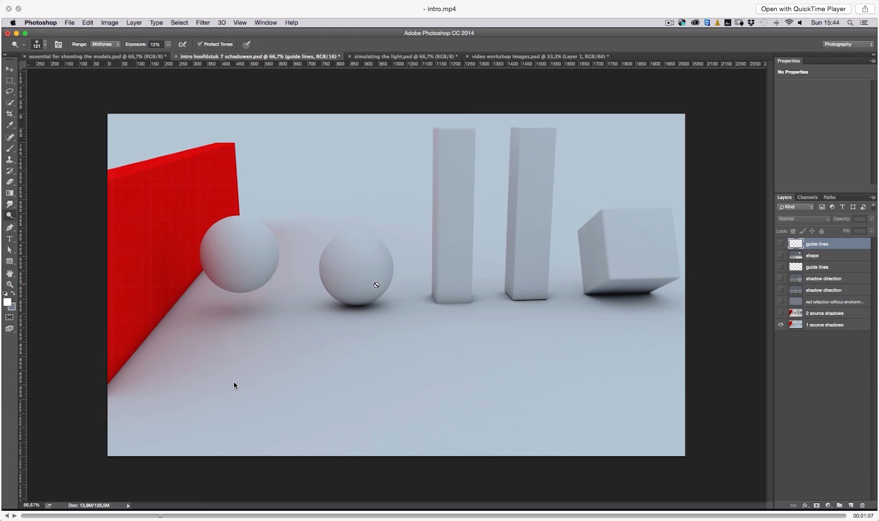
You might think that cutting out the individual elements is the most difficult part of the procedure, but it is not. That award goes to the tedious process of creating realistic shadows. Have you ever wondered why most composites (and compositing tutorials) only work with portraits from the waist up? That’s because it’s really difficult to create realistic shadows. And this is exactly what the biggest part of this DVD is about: Adrian gives us a little theory about shadows (I love his simple yet informative slides) and then he explains how to make contact shadows and ambient shadows.

Adrian's explanation on the types of shadows, their importance and how to recreate them from scratch is simply the best I've seen in any compositing tutorial.

Adrian's explanation on the types of shadows, their importance and how to recreate them from scratch is simply the best I've seen in any compositing tutorial.

He really makes you see your composite in three dimensions: there’s the shadows that the sun casts on the elements in your composite, but there’s also the shadows that the elements in your composite cast upon each other. Here again, I was surprised to see how he manually paints his shadows and then refines them with a layer mask. The closer a shadow is to its origin, the harder its contour will be and Adrian teaches you exactly how to simulate that.

All the elements placed into the scene. Without shadows, it definitely looks fake. Image © Adrian Sommeling.

All the elements placed into the scene. Without shadows, it definitely looks fake. Image © Adrian Sommeling.

After adding the different shadows: not only the long shadows caused by the sun, but also the contact shadows and the shadows that the elements of the scene cast upon each other. Image © Adrian Sommeling.

After adding the different shadows: not only the long shadows caused by the sun, but also the contact shadows and the shadows that the elements of the scene cast upon each other. Image © Adrian Sommeling.

Getting the 3D look

One thing that is really typical for Adrian’s work is a very threedimensional feel: the elements seem to leap off your screen. He does that partly with his lighting, partly with his choice of lens (mostly wide-angle) and viewpoint (close to the ground) and finally, partly with his postprocessing. Adrian shows you how he uses relatively simple dodge and burn techniques to make his subjects stand out better.

Finishing touches

The final chapters are dedicated to ‘finishing touches’ such as replacing the sky, making tonal corrections, adding some Color Efex Pro (one of my own favourite plug-ins) and adding motion blur.

A nice personal touch is that Adrian uses his son in a lot of his composites. I can only imagine the kick the young boy must get out of seeing himself in these super composites.

Source files included

The DVD comes with all the source files, so you can try to mask them yourself and then put them together. My own boy is two and a half years old. He’s still too impatient to model for me and that probably (and luckily) gives me a year or two to work on my composites. In the mean time, I’ll rewatch Adrian’s DVD a couple of times!

Conclusion

As you might have guessed by now, I can really recommend this DVD. 85€ is a very fair price considering the amount of info that you get and given the fact that all the source files are included. In fact, if you ever consider taking one of Adrian’s workshops, this DVD is an excellent boot camp. In order to get the most out of this training DVD, I do recommend you should be familiar with layers, layer masks and adjustment layers. If you aren’t, I would recommend taking a basic Photoshop course first. I'm obviously slightly biased but I have had some really nice reviews about my own - seven hour - ‘Photoshop for Photographers’ over at Craft & Vision. Alternatively, if you speak Dutch, the Photoshop courses Marit Hilarius and I have created for the Dutch Photography, Lightroom and Photoshop online video tutorial website Photofacts Academy. For the latter, you can get a 2 week free trial (no credit card required) here.

YOU MIGHT ALSO BE INTERESTED IN...

An advanced Smart Filter workflow with Alien Skin Exposure and Nik Software Viveza

If you follow this blog or if you've read some of my eBooks, you know I love working with plug-ins. For example, for film simulation I really like Alien Skin's Exposure. For local edits like dodging and burning, I like the Control Point technology found in Viveza by Nik Software. In this video, I'll show you a way to combine the best of both worlds, all while keeping your effects completely re-editable.

Now that is one cool workflow, isn't it? I actually forgot to mention yet another advantage of the Smart Filter workflow in the video: if you double-click on the icon in yellow (see screenshot below), you enter the Smart Filter's Blending Options. In that dialog box, you can not only change the Blending Mode for extra effect, but you can also reduce the Opacity to globally scale back the effect of the plug-in without having to dial back all of the individual sliders!

screenshotExposure.png

I hope you learned something from this 12 minute video. If you did, imagine what you could take away from 70+ hours of video tutorials (and over 10 eBooks, and hundreds of Lightroom presets): for only a couple of more days, you can take advantage of the 5 Day Deal, a unique bundle of photography training resources (including some 5 hours of video training by yours truly) that normally retails for over $3.300, but that can now be purchased for only $127! With 39 top-notch instructors like Zack Arias, David duChemin, Lindsay Adler and Joel Grimes and one über-geeky Belgian-with-a-strange-accent (that would be me) you're bound to learn a ton!

You can grab that bundle here and you're not only doing yourself and your photography a favour: 10 percent goes to charity. Last year's 5 Day Deal raised over $200.000 this way!

If you still need some convincing, check out yesterday's announcement post!